
All those logos, and we haven’t even introduced ourselves.

M

I

R

A

K

O

D

We design for everything your name has to live up to.

Making clients go,“That's exactly it!”

In the fashion industry, especially when you're working with retailers and boutiques, how your brand presents itself matters just as much as the collections you offer. We wanted Rovira to have a strong identity of its own, something that felt contemporary but still carried the richness of Indian occasionwear.

What MiraKod created was quite different from the typical visual style you see in our category. The identity doesn't rely on heavy ornamentation or obvious traditional elements to communicate luxury. It feels refined, recognisable and appropriate for the kind of brand we're building.
Seeing everything come together gave us a much better sense of how Rovira could present itself in the market. The identity complements our collections rather than competing with them, which is exactly the balance we were looking for.
Yash Bhageria

Founder

Rovira
View Project

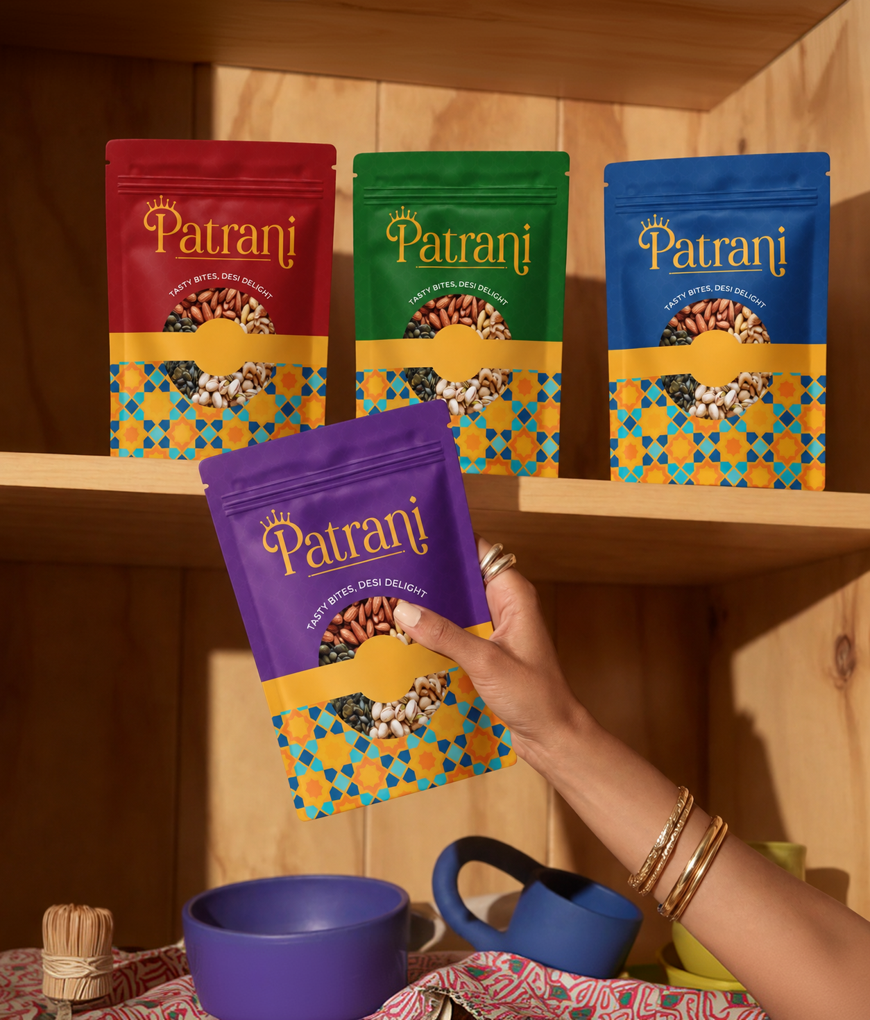
The response to our new packaging design was really encouraging. A few people even told us that the packaging looked good enough to be sold internationally and that we should consider exporting it. Hearing that was a great feeling, especially because we wanted something that would stand out.

One thing we particularly appreciated about working with MiraKod was how they handled our feedback. We had our own ideas and suggestions throughout the process, and we always felt heard. They would incorporate suggestions that worked, and when something wasn't right for the design, they would explain why instead of simply saying no. That made the whole process much more comfortable because we could share our thoughts openly without feeling that we were interfering with their work.

We're really happy with how the packaging has turned out and the response it has received so far.

Rakesh

Founder

Kounter
View Project

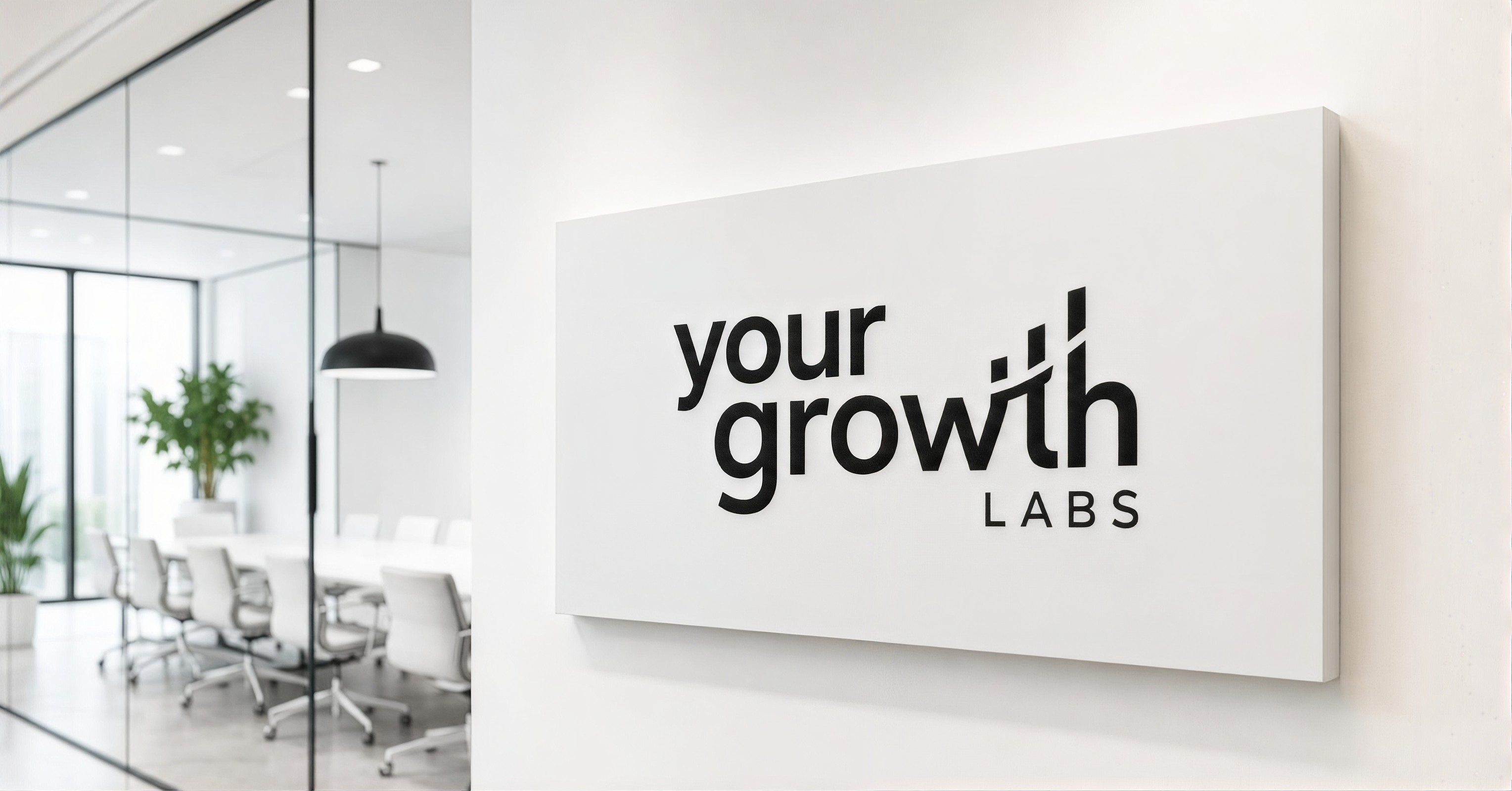
What stood out to us most was the wordmark. It's simple, but the way MiraKod incorporated the idea of growth into the lettering was really clever. Even the alignment and composition of the three words were carefully considered, and together, those details make the identity distinctive. It's impressive how something so minimal can communicate so much without needing a separate icon.

As an agency specialising in quick commerce and growth, we already knew what we wanted our brand to communicate. MiraKod understood that and translated it into an identity that reflects our work and the kind of businesses we work with.
We've since seen the identity come to life across our presentations, merchandise and other brand materials, including an event we organised for our community. What we particularly like is how recognisable the wordmark remains across different applications. It gives Your Growth Labs a strong, consistent presence without making the branding feel complicated.

Raghav Jhawar

Co-Founder

Your Growth Labs
View Project

Crochet is something very personal to me, so I didn't want the branding to feel too commercial or lose that handmade feeling. At the same time, I wanted it to look fresh, fun and a little different from what you usually see with crochet brands.

Anshika managed to bring both together beautifully. There are little details in the identity that make it feel so much like my brand. It's lovely seeing something I've built with my own hands have a personality of its own. I genuinely feel happy every time I look at it!

Loveleen

Founder

It’s a Crochet Thing
View Project

Two years. That's how long we'd been trying to get our brand identity right. Multiple designers, different agencies, so many options, and somehow nothing was clicking. We'd honestly reached a point where we were just tired of the process.
Then we worked with MiraKod, with Anshika, and the team finally got it.

The identity turned out exactly the way we'd hoped, and the best part is the response we're getting. Every time we show it to someone, there's a positive reaction. After struggling with this for so long, it feels great to finally have an identity we're genuinely proud to share.

We love it!

Dikshant

CMO

Riti Riwaj
View Project

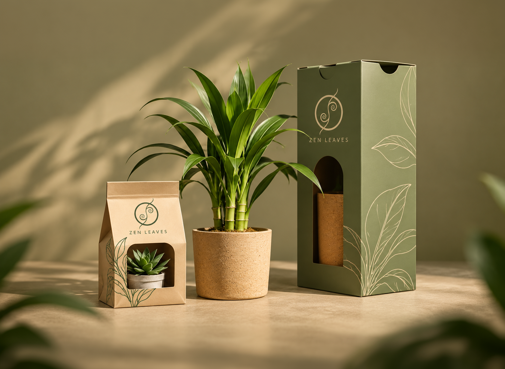
Zen Leaves and Zen Flourish are sister brands, but we didn't want them to look like the same business with two different names. One is about plants, while the other focuses on flowers and gifting. They needed their own personalities.

I like how differently MiraKod approached the two. Zen Leaves has a quieter, more understated identity that lets the plants stand out. Zen Flourish has its own character, and the way the identity comes together on the gift bags, bouquet tags and other packaging details is lovely.

The little things make a difference. Even though both businesses belong to us, neither identity feels like a copy of the other. They each have something of their own, which is exactly what we wanted.

Keshav

CEO

Zen Leaves
Zen Flourish
View Project

OUR CLIENTS

You Could

be next

FEATURED ON

A branding & design studio shaping how brands are understood before they're experienced.

© 2026 MiraKod Studio. All rights reserved.